Line graphs will usually show data totals at particular points in time for particular groups of people.
A line graph could also represent the scores of a class on various projects over the course of an academic year.
In order to understand how to interpret the data on a line graph, you should be acquainted with the different parts of line graphs.
Line Graphs − x Axis and y Axis
Line graphs have an x axis and a y axis.
The x axis lies horizontally at the bottom of the graph.
The y axis is vertical, and it lies at the left side of the graph.
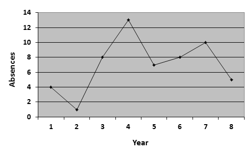
Now look at the graph below.

Years are represented on the x axis of the graph above.
On the other hand, the total amounts of absences are represented on the y axis of the graph.
There is only one line on the above graph, so it is a line graph with a single data set.
Line Graphs with Single Data Sets
Now try the following question.

(1) Between which two years did the absences at Springfield High School change the least?
A. Years 1 and 2
B. Years 2 and 3
C. Years 3 and 4
D. Years 5 and 6
E. Years 6 and 7
STEP 1: First, you should visually inspect the graph to rule out the answers that are obviously incorrect.
If you are looking at a line graph and the question is asking you which time period has changed the least, then you need to determine which line segment is the shortest.
We can see that the line segments are quite long between years 2 and 3, as well as between years 3 and 4 and between years 4 and 5.
Accordingly, we can rule out answers B and C by visual inspection.
STEP 2: Now, use the horizontal lines that run across the gray area of the graph to help you measure the changes.
The distance between each set of horizontal lines on the graph represents two absences.
Between years 1 and 2, total absences changed by 3.
Between years 5 and 6, total absences changed by 1.
Between years 6 and 7, total absences changed by 2.
The absences changed the least between years 5 and 6.
Line Graphs with Multiple Data Sets
You may also see line graphs that have more than one line, like the one show below.
Questions on these types of graphs will usually ask you to compare the lines.

(2) During which year was there the greatest difference between the scores for the boys and the girls?
A. Year 1
B. Year 2
C. Year 3
D. Year 5
E. Year 6
Again, you can use the horizontal lines on the graph to guide you.
We can see that the difference between each pair of horizontal lines on the graph represents 5 points.
In year 6, the difference spans more than two lines; therefore, the difference between the boys and girls in this year is more than 5 points.
This is the greatest change in any year, so the correct answer is E.