Vertical Bar Charts
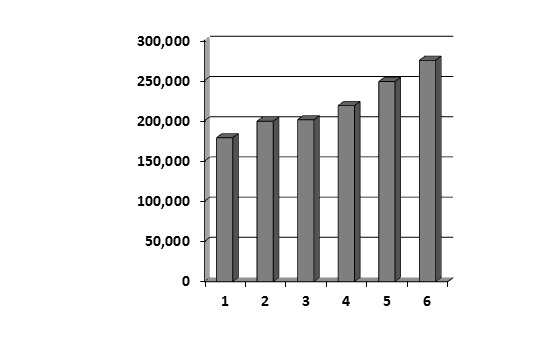
Bar charts may be represented in vertical format like the one below:

In the vertical bar chart above, the amount of deaths are represented on the y axis, which is the left side of the graph.
The years are represented across the bottom of the chart. This bottom area of the chart is called the x axis.
We can see from looking at the chart above that 6 years’ worth of information is shown.
Now, try the question that follows.
(1) Between which years did the number of deaths in Jackson County change the least?
A. Years 1 and 2
B. Years 2 and 3
C. Years 3 and 4
D. Years 4 and 5
E. Years 5 and 6
To answer the question, you need to look at the chart and compare the bars.
The example question is asking us which two years had the least change between them.
If two years have not changed much, then the bars for those two years will be nearly level across the tops in the case of a vertical bar chart.
So, we need to look at the chart to find the two bars which are nearly equal to each other.
We can see from looking at the vertical bar chart above that years 2 and 3 are nearly equal.
So, the correct answer is B.
Horizontal Bar Charts
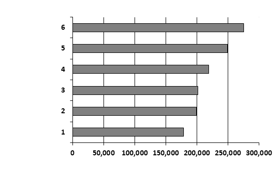
Bar charts can also be horizontal, like the one that follows:

Now try the next question.
(2) Between which years did the number of deaths in Jackson County change the most?
A. Years 1 and 2
B. Years 2 and 3
C. Years 3 and 4
D. Years 4 and 5
E. Years 5 and 6
The example question is asking us which two years had the greatest change between them.
For this example problem, we need to look at the chart to find the two bars which are the farthest apart.
Questions like this can be difficult when the data is only roughly represented and there is nearly equivalent growth between certain years.
Look to see which of the bars is past the halfway point between the two lines.
The bar for Year 1 is more than halfway between the two lines representing 150,000 and 200,000. So, the change between these two years was less than 50,000.
The bar for Year 6 is halfway between the two lines representing 250,000 and 300,000. So, the change between these two years was also less than 50,000.
However, the bar for Year 4 is slightly less than halfway between the two lines representing 200,000 and 250,000. So, the change between these two years was more than 50,000.
Accordingly, the change between years 4 and 5 is the greatest.
So, the correct answer is D.